Case Study

NAPA PROLink - Genuine Parts Company
Overview
Duration:
Additional Team:
My Role:
Tools Used:
9 months
Product owner, lead engineer, UX manager, Jr. UX designer
UX researcher, senior UX designer,
Figma, Miro, Wave, Adobe Creative Cloud, UserZoom, SurveyMonkey
Problem Statement
Users are experiencing frustration and decreased efficiency when navigating the current NAPA “PROLink” experience due to critical usability challenges in its design.
Summary

NAPA "PROLink" is a B2B e-commerce platform designed for auto shops to purchase after-market auto parts. There, users can (but not limited to): Search, order and compare auto parts and related products. Users can also create estimates, access a wealth of technical part information, integrate with shop management systems as well as access order history and invoices.
Exploring the Problem
Users are experiencing frustration and decreased efficiency when navigating the current NAPA “PROLink” experience due to critical usability challenges in its design.
Who are the users:

Independent auto repair shops & service bays

Commercial fleet operators & installers


Professional mechanics and auto-care centers

NAPA-affiliated shop management software users (TRACS)
The Results:
↑2.1%
Conversion Rate
↑30%
Average Order
Value (AOV)
↑18.1%
Customer Satisfaction Score
UX Audit of Legacy Site
The first step of the redesign was to look at the existing experience. A UX audit of the legacy site was performed looking for critical usability issues. This was done across the site but below are examples of the homepage and the product listing page (PLP).

UX audit of the Homepage

UX audit of the Product Listing Page (PLP)
Research
We used several research methods to get a well-rounded understanding of the product experience—combining surveys, interviews, competitive analysis, and UX audits allowed us to validate findings from multiple angles and uncover both what users do and why they do it.
Method
Why?
1. Competitive analysis
2. Sentiment survey
3. Stakeholder interviews
4. User interviews
5. Contextual Inquiry
Benchmark against industry standards. What are the differentiators in our competitors experience? Can we anticipate market trends? Are there features that we should look at?
Where do our users see pain points and gaps in the experience? What isn’t working when we poll large numbers of our users?
Business & technical alignment.
Deeper, firsthand insights into real needs, behaviors, and frustrations that surveys and analytics alone can’t uncover.
Contextual inquiry is used as a research tool to uncover deep insights about user behavior and needs by observing and interviewing them in their actual work environment.
1. Competitive Analysis
I conducted a competitive analysis to understand how similar platforms approach key features, user experience, and positioning. This helped us identify industry standards, spot gaps and opportunities for differentiation, and set a clear benchmark to ensure the new design meets and exceeds customer expectations
OUTPUT
Strengths of NAPA PROLink:
-
Strong VIN lookup and compatibility confidence
-
Good depth of product data (specs, fitment)
-
Smooth ordering process
-
Solid customer support resources
Weaknesses / Gaps Compared to Competitors:
-
Delivery tracking less advanced than O’Reilly First Call
-
Some UI elements and dense tables feel dated
-
Filtering can be slow under heavy catalog loads
Opportunities for UX Improvement:
-
Improve Filtering Speed and Precision: Faster, smarter filters (e.g., dynamic narrowing without page reloads)
-
Enhance Delivery Tracking: More real-time ETA updates and proactive notifications
-
Refresh Visual Design: Streamline dense screens for faster scanning
-
Optimize Mobile Experience: Ensure full feature parity on tablets and phones

Competitive analysis snapshot
SUMMARY (overall score 1-5)

2. Sentiment Survey
I used a sentiment survey (SurveyMonkey) to quickly gauge how users feel about key aspects of the product and uncover patterns in satisfaction, frustration, and expectations. By combining quantitative ratings with open-ended comments, the survey provided both measurable insights and rich context, helping us prioritize improvements that will have the biggest impact on user experience and overall perception of the platform.


Sentiment survey results
3. Stakeholder Interviews
I conducted stakeholder interviews to align the user experience with business goals, gather cross-functional insights, and understand internal priorities and constraints. These conversations helped ensure that the redesign addressed not only user needs but also the strategic objectives of key teams across the organization.
Stakeholder
Goals related to UX
Product Owner
Marketing Lead
Customer Support Manager
Engineering Lead
Sales Director
Increase conversion rate
Increase average order value (AOV)
Enhance product discovery and content personalization
Reduce support tickets related to navigation and returns
Build scalable, maintainable front-end with responsive design
Increase online sales, improve cross-sell and up-sell UX
Stakeholder Quotes
-
“"With nearly $2 billion in revenue [currently], even a small shift in conversion could have a massive impact." - Product Manager
-
“I hear every day about critical UX issues that need to be addressed ” - Customer Support Manager
-
“The redesign is a chance to clean up a lot of technical debt, but we need to make sure it’s not just a fresh coat of paint. If we’re touching the foundation, let’s fix what’s broken under the hood too.” - Engineering Lead
4. User Interviews
We conducted user interviews to gain firsthand insights into the needs, behaviors, and pain points of our core users. These conversations allowed us to validate assumptions, uncover real-world challenges, and ensure the new design would directly support the tasks and goals that matter most to the people using the platform every day.

Notes from Customer Interviews
Key Insights from Shop Interviews
What’s Working Well
-
Vehicle lookup tools are accurate and familiar.
-
Parts availability visibility is strong, especially for local inventory.
-
Saved carts and job tracking help streamline larger jobs.
-
“Quick Picks is a feature that tests very well.”
Pain Points
-
Users find it frustrating that they often have to go to the product detail page to find what they consider basic information like availability.
-
When a search is performed users find that they need to sift through the results often times having to go to a second page of products
-
Mobile experience is very under utilized do to critical usability issues.
Feature Requests & Opportunities
-
Better filtering on Product Listing Page (PLP)
-
Ability to view more images from PLP
-
Improved mobile/responsive layout
-
Access to install guides or torque specs
-
Ability to compare parts visually (photos, specs)
Common Workarounds
-
Calling the NAPA rep directly for part help or stock checks
-
Using paper or external apps to track jobs instead of relying on PROLink
-
Switching to competitors' platforms (like O’Reilly or AutoZone) when frustrated
5. Contextual Inquiry
We performed contextual inquiry to observe how real users interact with the system in their actual work environments. This approach helped us uncover hidden workflows, pain points, and unmet needs that don’t always surface in interviews, ensuring our design recommendations were grounded in authentic behavior and context.

.png)
Journey Map
Research synthesis
After coordinating and conducting thorough rounds of user research including, competitive analysis, contextual inquiry, surveys, heuristic evaluation, long-form interviews and UX-focused assessment of website metrics, it was clear that there were significant opportunities in a redesign of the experience.
Core needs the design must address:
-
Homepage:
-
Adding a vehicle needs to be as quick and efficient as possible (global)
-
Clear visibility into recent vehicles / searches
-
Quick access to recent orders
-
"Buy it again" type module
-
Make "Quick Picks" more effective
-
-
Product Listing Page (PLP) needs to better address the needs of the user/business:
-
Clear shipping information
-
Pods need to be more scanable
-
Better product discovery
-
-
Product Detail Page (PDP)
-
Cross selling opportunities
-
Some users overwhelmed by the amount of detailed product information. Needs to be more clearly presented
-
Design iteration
Here, I started with a series of whiteboarding sessions. Using the research findings as a lens, we began moving through the experience and sketch out possible realizations of the experience.
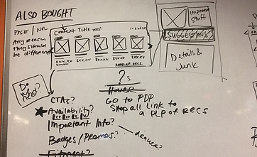


Preliminary Sketches
Low Fidelity Wireframes
After the whiteboard sessions had some direction, I took these back to Figma to start distilling them into something more cohesive. These took the form of very low fidelity wireframes which were shared with key stakeholders. The objective here was to get alignment at a high-level before the more detailed interactions are designed for. By omitting the detail, it avoids swirl around granularities that could distract from making the more foundations decisions at this stage.

Homepage Low Fidelity Wireframes

Product Listing Page Low Fidelity Wireframes

Product Detail Page Low Fidelity Wireframes
High Fidelity Designs and User Testing
After the low fidelity wireframes are agreed upon, I translated them into high fidelity wireframes to be tested. Two variations (at least) of the key they experiences were designed (not all shown here). These were then translated into prototypes.
Usability Testing
Overview
Purpose & Goals:
-
Assess task efficiency – Can users quickly look up parts for both applicated (with vehicle) and non-applicated?
-
Evaluate navigation & search – Do users understand filtering, categories, and part details?
-
Identify pain points – Where do users encounter delays, confusion, or mistakes?
-
Validate ordering flows – Is the checkout and order confirmation process smooth and reliable?
-
Measure satisfaction
Participants:
-
12 Service Advisors from various regions
Method:
-
Remote, moderated testing
Tasks:
-
Ease of adding a vehicle
-
Finding a specific product
-
Adding to cart
-
Navigation
-
Clarity of product pod information
-
Product detail page information
-
Identify usability issues in checkout flow
-
Measure overall user satisfaction
Metrics to Collect:
-
Task success rate
-
Time on task
-
Error rates
-
User satisfaction (post-test survey, SUS score, etc.)
-
Observational notes (frustration points, navigation patterns)
Logistics:
-
Session length- 45 min
-
Tools- Testing performed over Zoom using Figma prototypes
Stakeholder
Goals related to UX
Product Owner
Marketing Lead
Customer Support Manager
Engineering Lead
Sales Director
Increase conversion rate
Increase average order value (AOV)
Enhance product discovery and content personalization
Reduce support tickets related to navigation and returns
Build scalable, maintainable front-end with responsive design
Increase online sales, improve cross-sell and up-sell UX
Homepage testing
There were several considerations in the design of the homepage based on our research:
-
Quick addition of a vehicle for "applicated" searches
-
Easy access to "quick picks" selections
-
Clear visibility into recent vehicles / searches

Homepage Design A
Version A Differentiators:
-
Vertical "Add Vehicle" module
-
"Quick Picks" more visible
-
No mini cart displayed

Homepage Design B
Version B Differentiators:
-
Horizontal "Add Vehicle" module
-
Consolidating Add Vehicle / Recent Vehicles / Saved Vehicles in tabs
-
"Quick Picks" more visible
-
Mini cart / saved cart displayed. This was something that existed in the legacy site and users had an appetite for. Our suspicions were that this could be due to the fact that they were familiar with this and that it could be moved up to the header as a rollover leaving critical real estate made available.

Homepage Design Mobile

Homepage Design Mobile (cont)

Homepage Design Mobile (cont)
Product listing page & Product pods testing
The product listing page (PLP) is arguably the most important display in the shopping experience. The majority (78%) of products added to cart are added from the PLP.

Product listing page (PLP) - Standard view

Product Pod A
Version A Differentiators:
-
Easy access to product comments, usage and Lost Sale features
-
Access to multiple product views from product listing page (PLP)
-
Fitment information at the top
-
Controls to more easily increase the quantity

Product Pod B
Version B Differentiators:
-
Horizontal "Add Vehicle" module
-
Consolidating Add Vehicle / Recent Vehicles / Saved Vehicles in tabs
-
"Quick Picks" more visible
-
Mini cart / saved cart displayed. This was something that existed in the legacy site and users had an appetite for. Our suspicions were that this could be due to the fact that they were familiar with this and that it could be moved up to the header as a rollover leaving critical real estate made available.

Product Listing Page Mobile
Product listing page testing - Views
The addition of multiple allows for a more flexible experience. Three views of the product listing page were tested:
-
Standard view (above)
-
List view (below, left)
-
Gallery view (below, right)

Product Listing Page (PLP) - List View

Controls for View Change

Product Listing Page (PLP) - Gallery View
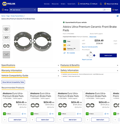
Product detail page testing
Although the majority of micro-conversions occurs on the product listing page (PLP), the product detail page (PDP) is still critical in the overall experience. Additional information such as product specifications, warranty information, features & benefits, etc. can all be found here.
.png)
Product Detail Page A
.png)
Product Detail Page B
.png)
Product Detail Page Mobile
"Compare" experience testing
Having a compare feature helps users evaluate multiple products side by side, making it easier to understand differences in price, features, and specifications. This reduces decision fatigue, building confidence in their purchase, and ultimately increasing conversions.


Product Compare View (detail)
Product Compare View
User Testing Results
1. Task Completion:
-
Ease of adding a vehicle - 10/12 added a vehicle without difficulty
-
Finding a specific product - 8/12 found the specified product in <1 minute
-
Adding to cart - 11/12 had no difficulty in adding a part to the cart
-
Clarity of product pod information - 10/12 found the product pod information relevant and clear
-
Product detail page information - 11/12 found the product pod information relevant and clear
2. Navigation & Search:
-
9/12 participants found search fast but noted inconsistent results with certain keywords
-
7/12 participants said filters were useful but hard to locate on mobile
-
5/12 participants overlooked the “Recently Ordered” feature.
3. Errors & Pain Points:
-
6/12 participants clicked into the wrong product detail page before finding the correct one
-
5/12 participants tried multiple times to add an item to the cart (unclear button feedback)
-
3/12 participants abandoned checkout once due to confusion with shipping/delivery options
4. Efficiency Metrics:
-
Average time to locate a specific part: 1m 15s (target: under 1m 30s)
-
Average checkout time: 2m 10s (target: under 3m)
5. User Feedback:
-
Positive: “Fast search when it works,” “Accurate product details,” “Order history is a lifesaver.”
-
Negative: “Too many clicks to filter,” “Checkout feels cluttered,” “Hard to find certain parts on mobile.”
6. Satisfaction
-
Overall satisfaction rating (1–5): 3.8
-
9/12 participants said they would use PROLink regularly if improved
-
3/12 participants preferred competitor tools due to “cleaner layouts.”
Responsive design
Responsive design is critical because users expect seamless experiences on any device, and a poor mobile or tablet experience can mean lost trust, engagement, and sales.

Accessibility (ADA Compliance)
-
Keyboard Navigation: All menus, forms, and checkout steps are easily navigable without a mouse.
-
Alt Text for Images: Descriptive alt text was provided for product photos so screen reader users understand the visuals.
-
Readable Text & Contrast: Sufficient color contrast and scalable text was designed for readability.
-
Scalable Text – Content remains readable when zoomed (up to 200%).
-
Form Labels & Errors: Label fields (e.g., shipping, payment) and provide accessible error messages.
-
Accessible Filters & Sorting: Product filtering and sorting usable with assistive technologies.
-
Focus Indicators – Visible outlines showing which element is selected when navigating with keyboard.
-
Mobile Accessibility: Ensure responsive design also supports screen readers, zoom, and touch targets.
The Results:
↑2.1%
Conversion Rate
↑30%
Average Order
Value (AOV)
↑18.1%
Customer Satisfaction Score
The redesign of NAPA PROLink focused on transforming the platform into a more intuitive, efficient, and user-centered experience for automotive professionals. Through stakeholder interviews, user research, and competitive analysis, we identified pain points such as complex navigation, difficulty in product discovery, and challenges in checkout. The redesign introduced a cleaner, responsive interface that works seamlessly across devices, streamlined workflows for faster ordering, and enhanced product detail pages to support decision-making. Accessibility improvements, improved search and filtering, and personalized content recommendations were prioritized to meet diverse user needs.
Category
Before Redesign
After Redesign
Navigation
Complex menus, hard to find parts quickly
Streamlined, intuitive navigation with clear categories and breadcrumbs
Product Discovery
Limited filtering and outdated search
Advanced search with predictive text, smart filters, and personalized recommendations
Product Listing Pages
Lack of most relevant product information
Inclusion of availability information, supersede and kit components.
Product Detail Pages
Sparse info, inconsistent images, limited specs
Rich visuals, detailed specs, reviews, compatibility info, and clear CTAs
Responsiveness
Poor mobile and tablet experience
Fully responsive design optimized for all devices
Cross-sell / Up-sell
Minimal cross-sell visibility
Integrated recommendations to increase order value
Overall UX/UI
Outdated, cluttered, not aligned with modern expectations
Clean, modern UI with focus on efficiency, clarity, and professional tone
Lessons Learned
1. User Research is Essential
Early interviews revealed frustrations with navigation and checkout that shaped the redesign priorities.
2. Simplicity Drives Adoption
Streamlined workflows reduced clicks for key tasks, making ordering faster and easier for busy shop environments.
3. Mobile-First Mindset Matters
A responsive design ensured seamless access on tablets and smartphones, reflecting real-world usage in repair shops.
4. Accessibility is Not an Afterthought
Building in accessibility from the start improved usability for all users, including those using assistive technologies.
5. Competitive Analysis Adds Perspective
Learning from industry peers provided best practices in search, filtering, and product presentation.
6. Iteration Builds Better Design
Wireframes and prototypes tested with users led to continual refinements, preventing costly missteps later.
7. Cross-Team Collaboration is Key
Input from product, marketing, engineering, sales, and support ensured balance between user needs and business goals.
8. Clear Product Information Reduces Support Costs
Enhanced product detail pages and better returns flow reduced customer service inquiries.
9. Personalization Enhances Discovery
Features like tailored recommendations and saved preferences sped up product search and decision-making.
10. Trust is Built Through Transparency
Real-time stock updates, clearer error messaging, and smoother checkout increased confidence and repeat purchases.
Gallery